An Iconic Change in the Works…
Posted on October 31, 2024
Happy Halloween! We here at the GIC will be spending the holiday down in the laboratory, working feverishly on our fiendish plan to unify the look and feel of Delaware state agency websites!

Among the things we’re working on is integrating new visual elements into the Lighthouse design system. These elements must meet accessibility standards but should also be used in a consistent fashion. Lighthouse will help us all eliminate some minor graphic variances, and will go a long way toward reinforcing an official common look and feel across agency websites.
We’ve gotten as granular as selecting new fonts in Lighthouse, and we’re moving on to some of the most common imagery that will be used alongside your website text: icons!
Currently, GIC sites get their icons from the open source Font Awesome. This is a useful resource, but it allows for some customization of icon type (solid, pro, free), sizing and color. Here’s a sample of some of the icons currently in use across a some of our state agency sites:
They all look good! But they don’t look like they are representing the same brand; in this case, the state of Delaware.
To address this, the GIC will be selecting icons for Lighthouse from Material Symbols within the Google open source library. They will be selected for accessibility and uniformity, and placed into a growing library that we will be curating. There will be a deliberate limit on the number of icons available in Lighthouse, as we refocus to use our graphics sparingly, and with more thoughtful intention.
Here’s an idea of how we’ll be using the new icons:
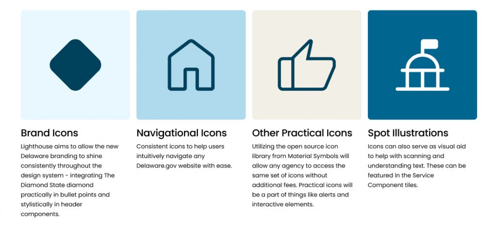
For consistency, we’ll be primarily using Material Symbols icons that are:
- Rounded style
- 200 weight (as a starting point)
- Icon fill will be off in most cases
Here’s a preview of some of the icons you’ll be seeing a lot in Lighthouse:
We are excited to reveal our first Lighthouse website in the coming months, and will keep bringing you all our development updates here in this blog. If you have any feedback you’d like to share, we’d love to hear from you!
Until next time, stay safe and have fun out there!
Stay Updated
Receive the latest news from the GIC.