Choosing New Fonts for Lighthouse
Posted on September 19, 2024
One of the GIC’s main goals is to put accessibility at the forefront of our process. We always want to keep in mind those with visual, hearing and other disabilities as we make each website design decision.
This approach calls for reconsideration of colors, backgrounds, and the text itself that we use.

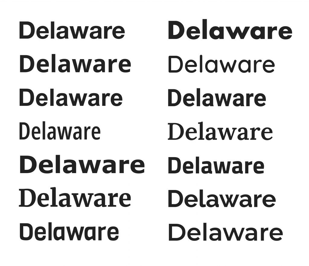
Many different fonts are used across today’s Delaware state agency websites, with varying degrees of success from an accessibility standpoint.
Here is a sample of some of the fonts that are currently being used online by various agencies:

That’s a lot of inconsistency!
As we look to unify our online appearance, we need to remember that research has shown certain fonts to be easier to read for individuals with cognitive disabilities.
Accessible fonts are designed and selected for considering factors such as width, thickness, and height. Truly accessible fonts should be also widely available to users with different devices and operating systems.
Key considerations for these fonts include providing sufficient spacing between letters and characters, ensuring unequal heights to clearly differentiate between uppercase and lowercase letters, steering away from thin-weight and narrow-width fonts, and the review of background colors and images to make sure the contrasts don’t affect readability.
With all that in mind:
The GIC design team has selected the open-source Google fonts Poppins and Arvo to use throughout Lighthouse!

POPPINS font
- Geometric Design: Poppins features a clean, geometric design that enhances legibility, making it easy for users to read text quickly.
- Variety of Weights: With multiple weights available, Poppins allows for clear hierarchy in text, which is crucial for guiding users through content.
- Good Letter Spacing: The font has well-defined letter spacing, which improves readability, especially for users with visual impairments.
- Modern Aesthetic: Its modern look appeals to a wide audience while remaining functional.
ARVO font
- Serif Typeface: As a serif font, Arvo provides excellent readability in both large and small sizes, making it a strong choice for body text.
- Distinct Character Shapes: The unique shapes of its letters help reduce confusion between similar characters (like ‘b’ and ‘d’), benefiting those with dyslexia or other reading difficulties.
- Versatile Styles: Arvo offers several styles, allowing for effective text hierarchy and emphasis without sacrificing accessibility.
- Clear Contrast: Its bold and clean design ensures good contrast against various backgrounds, enhancing overall visibility.
Both fonts prioritize clarity and usability, making them well-suited for inclusive web design.
The Poppins and Arvo fonts will also be applied throughout Lighthouse to guarantee accessibility across all Delaware sites that have been upgraded.

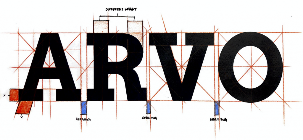
If you’d like to really geek out on the Arvo font in particular, here’s a fascinating design meditation to check out!!

We’ll have more details about the design specifics of Lighthouse in future posts.
Please don’t hesitate to reach out if you have any questions, comments, or would like to join us as a beta collaborator. We’d love to hear your feedback and to answer any questions you might have about Lighthouse!
Stay Updated
Receive the latest news from the GIC.

