Using Lighthouse …to Navigate!
Posted on November 15, 2024

We chose the name Lighthouse for our new state website design system for several reasons. It’s a nod to the many Delaware lighthouses that dot our beautiful coastlines, like the Harbor of Refuge Lighthouse in Lewes, seen above.
Symbolically, a lighthouse is a comforting landmark to help sailors orient themselves, avoid trouble and find their way to their intended destination without any disruption.
That’s the philosophy behind the Lighthouse design system as it will apply to the navigation of Delaware agency websites.
Our goal is to get Delawareans to the information they are looking for as efficiently as possible. That calls for streamlining and simplifying the navigation process within the website. Here’s a quick overview of how it will look.
Primary Navigation
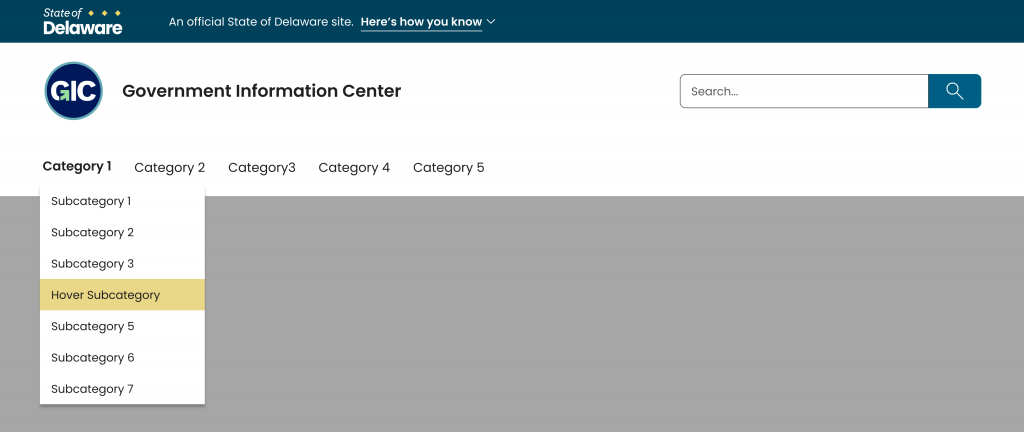
The primary navigation bar will appear beneath the agency header. The header includes the agency logo and name on the left and a search field on the right.
In the interest of accessibility, the navigation bar will be displayed with black text over a white background for maximum contrast and clarity. This blends seamlessly with the look of the agency header.

The primary navigation bar is the gateway to your website, and should contain thoughtful and direct options, listed with as little text as necessary.
There will be a limit of five categories across the top, and those categories can be direct links or they can have dropdown menus. Those dropdown menus will have a limit of seven subcategories. We recommend that each menu item text not exceed twenty characters total.
These guardrails will help agencies keep their sites in compliance with accessibility standards by decreasing the chances that the menu categories will exceed screen width and wrap to another line. That could affect the functionality and readability of some of the most important options you are hoping to offer your visitors. It’s also important to remember that the same text will be appearing on screens of many various sizes, so limiting the text and the options on the homepage will serve your site well in an increasingly mobile world.
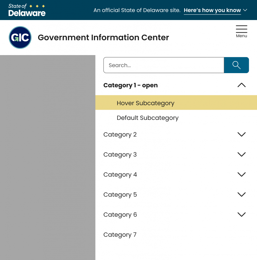
Speaking of which, in mobile and tablet versions of Lighthouse, the primary navigation will be found under a top-right hamburger menu, which will drop down to reveal categories and their possible subcategories.

Interior Navigation
Once your website visitors have chosen one of your primary category options, they’ll be sent to an interior page with more information. On both desktop and mobile, there will be a breadcrumb trail beneath the agency header.
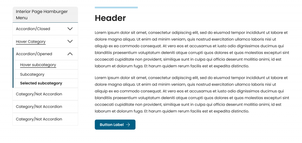
Pages other than the homepage may or may not need menus of additional options. The interior navigation bar is optional by page, and your Lighthouse website can have more than one interior nav menu. This will provide page-by-page flexibility, and an opportunity to better funnel your visitors to more specific information as a follow up to a more select number of primary options.
On desktops, the interior page navigation menu will open on the left. The categories that have dropdown menus are indicated by a downward chevron icon, which flips upward when the accordion opens.

On mobile devices including tablets, the interior navigation menu replaces the primary menu as a hamburger menu in the same spot beneath the agency header.

We believe the templates and parameters we’re building in Lighthouse will help guide agencies to keep their websites compliant and efficient.
But hey- why read about it when you can play with an online prototype?
The key to it all is making sure the content is laid out in a tree path that makes sense for the way users will be looking for each agency’s information. You may need to rethink some of your content and decide to split some into multiple pages. Your visitors won’t mind an extra click or two if each step is clearly farther along the path toward their goal. That will represent much less effort on their part than scrolling in search of links that may have been inadvertently hidden among the text in the top menu.
If you have any questions or feedback, we’d love to hear from you!
We’ll be back again in a couple weeks with more on the development of Lighthouse!
Stay Updated
Receive the latest news from the GIC.

