Things Lighthouse Won’t Have
Posted on February 6, 2025
Intentional Decisions to Omit Problematic Features
As we’ve rolled out our new Lighthouse website design system, we’ve been sharing lots of its cool new features through this blog. But we haven’t discussed the fact that there are also quite a few things that are currently being used on state websites that we’ve deliberately excluded from Lighthouse.
Embracing a holistic approach requires saying farewell to old features that aren’t doing our sites justice any more!
So today, we thought we’d take a moment to name some of the features we’ll be leaving out, and to share our research as to why.
One of the main reasons for creating a whole new design system is to help state agencies comply with changing accessibility standards. Our goal isn’t just to help set up fully-accessible websites, but also to help agency web editors maintain that status by providing page templates and components built with accessibility in mind.
Which brings us to the reality that there are a lot of commonly-used graphics, visuals and techniques that create challenges for disabled web users. It’s also worth remembering that many of these people are visiting our state websites as their only access to important services. In other words, this stuff affects real people, so we need to make sure we get it right!
Here’s a quick rundown of some of the things you WON’T find in our new Lighthouse websites, and why:

Out: Image Carousels / Slideshows
Why:
Websites have been featuring these for years as a quick way to look polished and professional. Unfortunately, these rotating photos cause a lot of problems. The images often lack alt text needed to describe them, they often rotate or change too quickly for disabled visitors, and they usually have start/stop controls that are small and difficult for some visitors to use. They can also add load time which could send visitors away before a homepage even finishes loading.

Out: Manual Statewide Notifications
Why:
Agencies that adopt Lighthouse under GIC services will no longer have to act as a middleman for important notifications, like emergency or health updates. Now, those notifications that come from the top levels of state government will be entered, activated and deactivated automatically. This ensures the consistency and timeliness of the messaging, and takes a task off the hands of agency editors. (Agencies that use third-party web vendors for Lighthouse will still need to update their statewide alerts manually.)
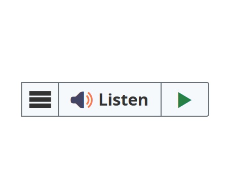
Out: ReadSpeaker
Why:
ReadSpeaker is a third-party assistive technology used to read content on websites. We conducted user research into this service and learned that many participants experienced technical issues that prevented them from being able to read the text on the screen. Most of them already also had access to other tools that were built into their browser or mobile device.

Out: Automatic Window Popups
Why:
Many state agencies are using pop-up windows to elicit subscriptions or make timely announcements about events or programs. This can create accessibility issues related to sudden and unexpected motion, a screen reader’s ability to catch up to the new window, and inconsistency regarding fonts and contrasting background colors. Modals that are activated by a button click are perfectly fine, but the ones that pop up automatically will not be in Lighthouse.

Out: Text Over Images
Why:
Text to background contrast ratio often does not meet accessibility standards, and many people have trouble reading the text as a result. While some text can be coded to be picked up by screen readers, text that’s embedded in the image (like on the left) would have to be added via alt text. Web editors will often post images of flyers without including that information in the alt text.

Out: Social Media Embeds
Why:
Embedded social media posts will often contain images without alt text, and will often include logos, fonts, and colors that are not accessible. They can also slow down page load times, and lead to third-party tracking concerns. Embedded posts can also affect user experience. For instance, mobile users can get stuck in the endless scroll of an embed, and any changes in the API feed can make the embed appear “broken” until code-level changes are made by developers.

Out: Excessive animation and Parallax effects
Why:
The parallax effect is a visual technique that creates the illusion of depth and movement by making objects closer to the viewer appear to move faster than objects in the background. It’s a technique used in computer graphics, video games, and animation that can impact site performance and can affect sensitive visitors. Small animations like text banners sliding onto a screen or number counters ticking up can cause disorientation and dizziness due to their unexpected motion. To be truly accessible, any screen motion should be activated by the visitor, with a clear way to avoid the motion altogether while still getting the information.

Out: Autoplay Videos
Why:
Videos that play automatically upon opening a web page can be disorienting for those with cognitive disabilities including motion sensitivity. WCAG rules say there needs to be a prominent start/stop button on videos so the user has control of the video motion.

Out: PDF Embeds
Why:
PDFs are traditionally harder for screen readers to scan and are notoriously out of compliance for accessibility due to lack of standardized fonts, colors, and other concerns.
Out: Google Translate
Why:
Google Translate can produce translations that are literal in nature, and can be nonsensical or grammatically incorrect. Google translations can also lose cultural context and misinterpret subtle language, like that used in sarcasm or jokes. When people are relying on state services in a language they don’t speak, important legal and health safety information could potentially be compromised. Google also retains ownership of any information used, which could include birthdates, social security numbers and bank information. When dealing with so many sensitive variables, there’s no substitute for human evaluation of language translations.
The key to delivering a clear and concise online experience for as many people as possible can be summed up with the philosophy of Less is More. Fewer images to distract, less text to overwhelm, and the elimination of some features that once seemed flashy or professional, but which we now know are largely distractions. Or worse, directly preventing people with disabilities from accessing the information.
Our goal with Lighthouse is to simplify the presentation and the process.
We look forward to helping your agency take its online presence to the next level, and to hearing from you if you’re interested in the process.
Stay Updated
Receive the latest news from the GIC.