Designing a New Header & Footer
Posted on August 5, 2024
Previous iterations of the Delaware State Common Look and Feel (CLF) provided a consistent header and footer for state agency websites to use, such as the ones on this webpage.
Our new version of the CLF is called Lighthouse. Lighthouse represents a comprehensive design system that will unify even more elements of state websites. This will include accessibility compliant components, curated color palettes and ready-to-use WordPress page templates.
It will also include a newly designed header and footer, which we are unveiling with this post!
Here is our current two-line header bar:

Here is our current footer:

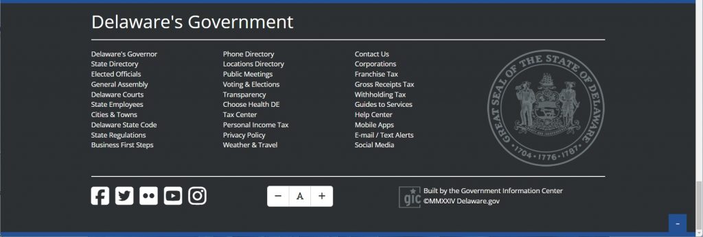
And here is our current expanded state government footer, revealed by clicking the blue plus sign:

Header Redesign
The design of Lighthouse is predicated on improving accessibility and user experience. We identified a few concerns with the current header design: Logos and seals are often too small, navigation can be confusing, and we need to more clearly differentiate between the links on the two stacked navigation bars.
With that in mind, we set some clear goals for the new header:
- Make sure the header continues to promote trust and security with users, making it clear that users are on an official Delaware site.
- Create a clear and simple search bar that’s straightforward and doesn’t hide important links or content.
- Highlighting agency-specific content and minimizing Delaware.gov portal links as the main event on the top header to reduce confusion and allow users to better find the content they came to find. On an agency site, the agency content should shine!
- Each agency name and logo needs to be accessible in the header to help users figure out where they are as soon as they get to the site without having to search. Separating navigation from the agency level header will allow ample space for both important elements.
Footer Redesign
We also evaluated the footer and identified a different set of issues. There tends to be much less consistency in styles, colors, logo placement, and sometimes text is not accessible as a result. We pulled analytics on the footer links for the State of Delaware and found that most of the links were never clicked. This is likely due to the number and placement of links.
So, our redesign goals for the footer were set:
- To better serve users with a functional footer that helps provide the information they need quickly.
- To offer a more intuitive/consistent experience throughout all agency sites with a unified style that is organized and doesn’t feel overwhelming.
- To adhere to best practices by sticking to 1 footer, reserved mainly for agency-specific information.
- Since users do use the footer to access the Delaware portal, provide the most-used portal links in a clear spot that is convenient.
- Offer some variations that will help account for common footer elements such as social media and subscription sign-up fields or a disclaimer section. These can be used when applicable.
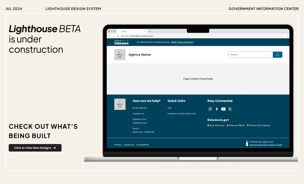
And here are the results:
Your First Glimpse at Lighthouse BETA
We invite you to explore the Lighthouse Figma preview to learn all about the new header and footer. As more components and features are researched we will be updating the Lighthouse Figma preview so please feel free to bookmark and check back.

Throughout the Lighthouse development process, we welcome your feedback and thoughts.
If you’d like to share any thoughts on the new design or anything else, please let us know what’s on your mind.
Stay Updated
Receive the latest news from the GIC.

