

The Big Impact of Small Words
Posted on August 21, 2026
Why Effective Microcopy is Crucial
“Microcopy” might sound like classified intel from a spy thriller, but there’s no secret code involved.
It’s simply the “next-step” instructions provided for your website’s visitors.

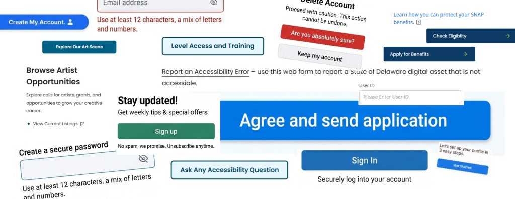
Microcopy is the short bits of text – button labels, link text, error messages, form field prompts – that guide visitors through their digital experience. Microcopy exists to solve immediate user problems, create clarity, and reduce cognitive friction.
When a visitor is guided efficiently to the services or information they came looking for, that site’s microcopy did its job.
The Plain Writing Act
It turns out that writing in non-flowery language is actually required, at least at the federal level.
The Plain Writing Act was passed by Congress and signed into law in 2010. It requires federal executive agencies to communicate in “clear, concise, well-organized” language to ensure the public can easily find, understand, and use government information.
While the law is often associated with formal documents, it also directly applies to microcopy. In digital public services, effective microcopy replaces ambiguous jargon with explicit verbs, clear instructions, and direct guidance.
This makes critical tasks like benefits applications or tax payments possible with less confusion and unnecessary steps.
What Makes Microcopy Effective?
Precision and Economy
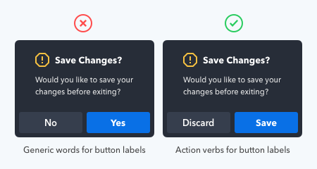
Active verbs help clarify and indicate specific calls to action. Unnecessary text should be eliminated, and only as many words as necessary should be used.
“Save Changes” as opposed to “Click here to save changes to your account.”
Clarity over Cleverness
Prioritize immediate clarity above all else. If a phrase confuses your visitor, it has failed its sole purpose. Don’t create a mental stop sign where an onramp should be.
If asking visitors to fill out a form, use “Begin application” as opposed to “Next” or “Start”.
Contextual Awareness
Remember your audience. Good microcopy should match the emotional state of the visitor at that moment; lighthearted on a confirmation page, direct and reassuring on a payment decline or a failure to find requested information.
Don’t be whimsical on a page dedicated to topics that might be stressful to visitors, don’t be too formal on a page about a children’s contest.
Visual Examples of Microcopy
Forms and Fields
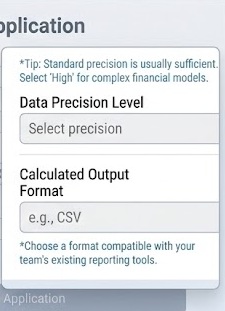
Helper / Hint Text
Persistent text placed directly below or above an input field to clarify formatting requirements, provide examples, or state why information is requested.
(e.g., “For example: name@agency.gov”)
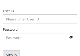
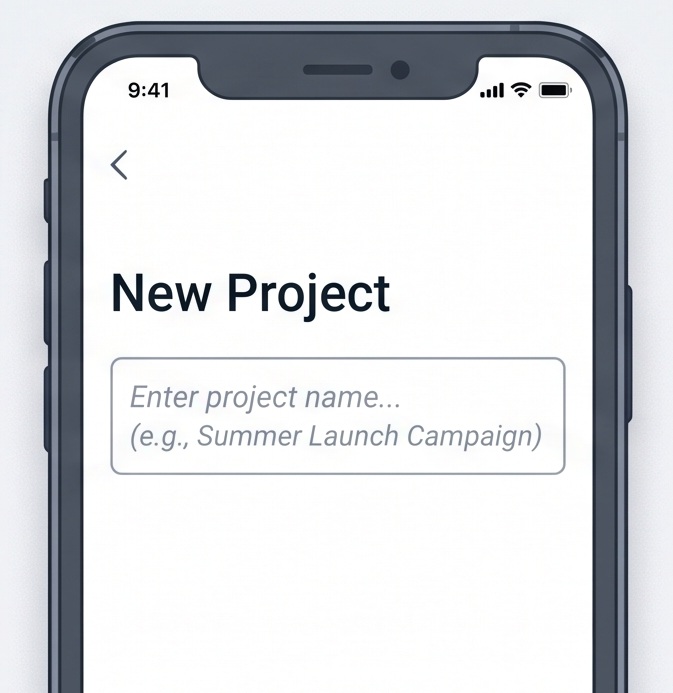
Placeholder Text
Temporary ghost text inside an input field that disappears upon typing. It should generally be avoided for critical instructions because it vanishes and creates accessibility barriers.
Field Labels
Concise, visible titles that identify the specific data required in an input, radio button, or checkbox.
(e.g., “Business Tax ID (EIN)”)
Navigation
Calls to Action (CTA) & Button Labels
Action-oriented verbs that explicitly tell the user what will happen next (e.g., “Save and continue”, “Download PDF”, “Review application”).
Link Text
Informative text embedded in or alongside body copy that describes the destination without using generic phrases like “Click here”.
(e.g., “View quarterly tax deadlines”)
Feedback and Validation
Error Messages
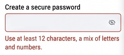
Specific, plain-language text that appears directly beneath a failed field explaining what went wrong and how to fix it.
(e.g., “Enter a date in the format MM/DD/YYYY”)
Success & Confirmation Messages
Banners or notifications confirming that an operation completed successfully.
(e.g., “Your payment has been processed. Confirmation #84920”)
Warning and Alert Banners
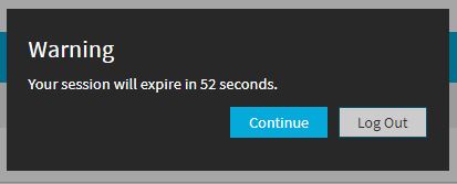
System-level notices warning users of impending consequences or system issues.
(e.g., “Your session will expire in 52 seconds.”)
Context and Status
Tooltips & Popovers
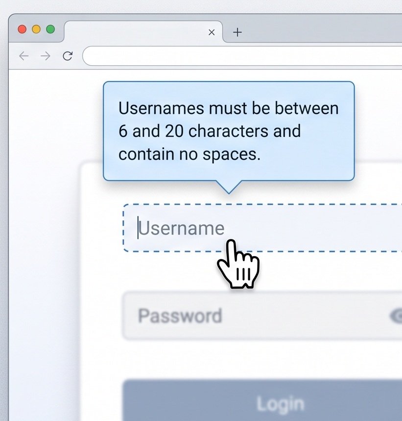
Short explanatory snippets revealed on hover, focus, or click to define complex terms or edge cases without cluttering the primary layout.
Empty States
Guidance shown when a page, list, or dashboard has no data yet, directing the user on how to populate it.
(e.g., “No saved reports found. Click ‘Create Report’ to get started.”)
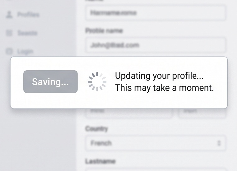
Loading / Progress States
Text paired with spinners or progress bars explaining backend processes to manage user wait times.
(e.g., “Verifying your filing status… this may take a few seconds”)
Security and Reassurance
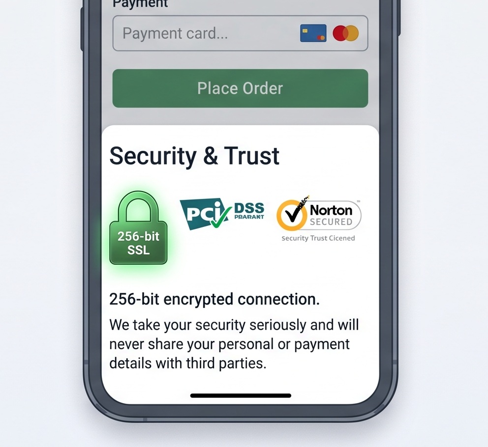
Trust Badges and Reassurance Text
Short statements near sensitive inputs (payment fields, SSN) that alleviate user hesitation.
(e.g., “256-bit encrypted. We will never share your email”)
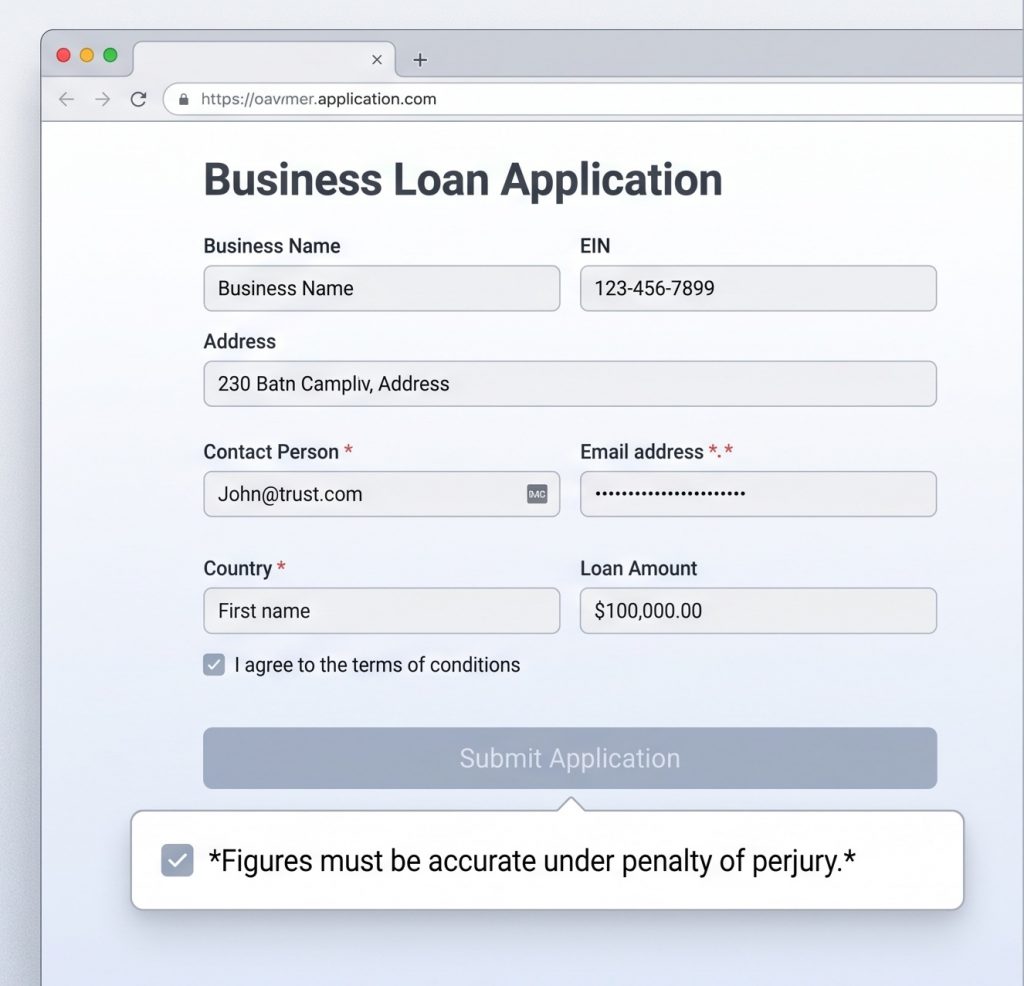
Micro-Disclaimers
Brief legal or compliance notes placed immediately adjacent to an action.
(e.g., “By clicking ‘Submit’, you certify that all entered figures are accurate under penalty of law”).
Final Thought

Here’s a good philosopy to consider:
If you can’t explain what a user needs to do in eight words or fewer, reconsider the design.
More Resources
Stay Updated
Receive the latest news from the GIC.