Unveiling our New State Branding
Posted on October 17, 2024
We’re going to step back a bit from our usual focus with this post. While we’ve detailed some of the upgrades coming to many Delaware state websites through our new design system called Lighthouse, there are other improvements in the works that are also worth calling out.
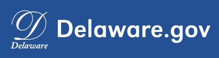
We’ve already shared the new website header, which many state agencies will soon be able to use. But change is coming within that header banner as well, in the form of new Delaware state branding! Let us explain.
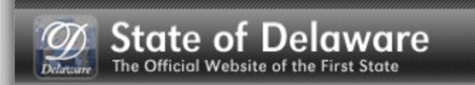
Here’s a look at the current branding at the top of most state agency websites, including the page you’re on now:
A Little History
The quill-inspired “D” logo originated in 2009, when it was part of the phrase “State of Delaware” in the state header. This font is called ALS Script.

In 2012, the state began using the letter “D” on its own, with the “Delaware” text beneath it in smaller point size.
From an accessibility standpoint, this one is particularly cringeworthy in hindsight. Hey, we live and we learn.
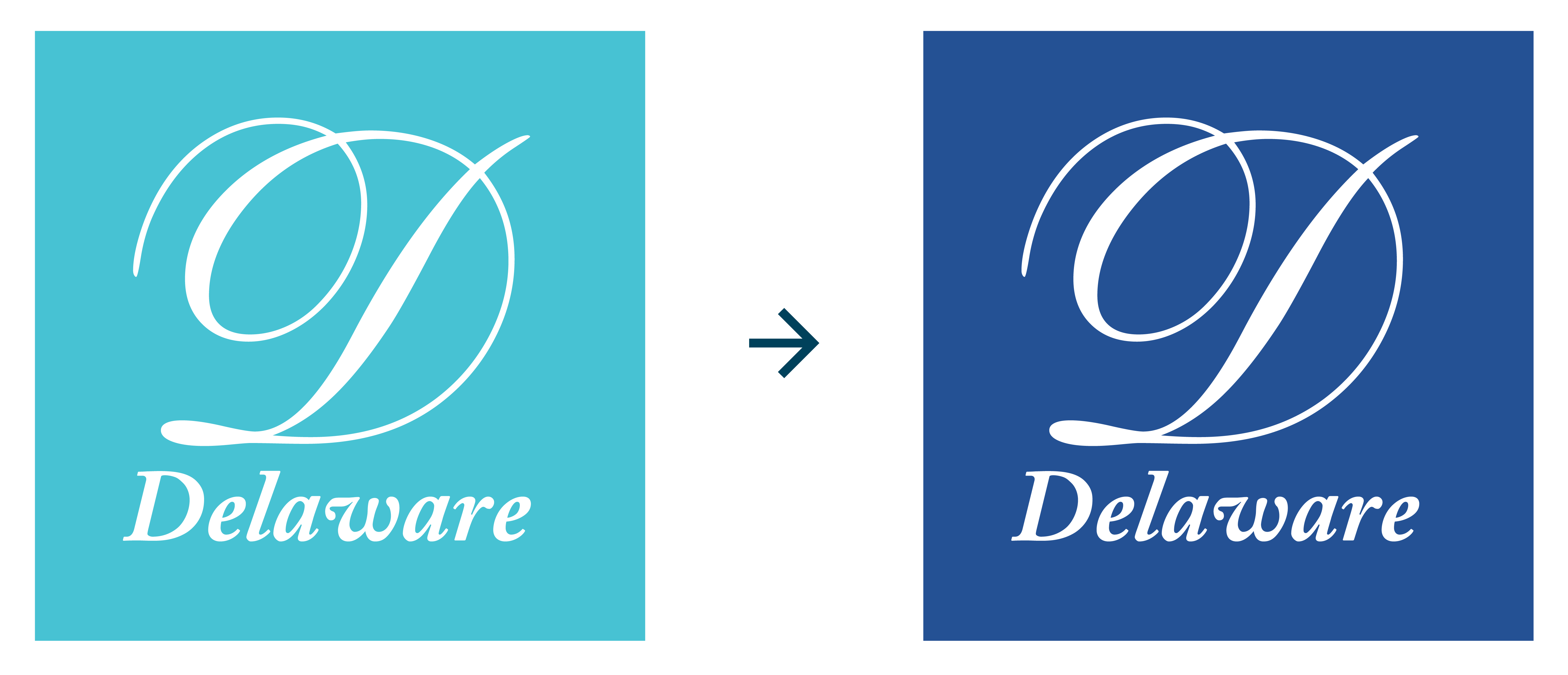
The logo was switched to a teal color in 2014.
However, this color did not pass 2021 accessibility standards, so we updated to the color called True Blue that is currently in use.
Unfortunately, this logo design itself is still not fully accessible by today’s standards. The scripted D can be difficult to read for the visually impaired, and the text beneath is hard to read in small scale.
Accessibility Pro Tip: Try not to choose the fanciest font in the list!
So, our amazing design team at the GIC has been working hard to address these concerns, and to take a more thoughtful approach to our state branding.
Colors, Fonts and Diamonds
After a thorough review process, we are changing the tone of the color that will serve as the new Delaware state header backdrop.
It’s called Pioneer Blue.

Additionally, we’ll be incorporating the complementary color called Lighthouse Gold. This combination is our nod to color schemes commonly found in Delaware institutions, including the state license plate and the University of Delaware.

The logo text will use the Arvo and Poppins fonts that we introduced to you in a previous blog post.
And as a final design element, the logo includes three diamond icons, representing the three counties of Delaware.
The Finished Product!
And here’s how that logo will appear in the new official state website header:

Our goal for every website we facilitate is to provide information that is clear, accessible, and trustworthy.
We believe the new state branding will help reinforce these ideals while serving as an anchor to help establish each agency’s identity, authority and credibility.
Timing and Availability
The new branding will make its debut with our first Lighthouse website, currently scheduled for January 2025.
As agencies adopt Lighthouse for their websites, they will acquire the new branding. The new branding will be available for any agency that adopts Lighthouse, whether the development is done under the umbrella of the Government Information Center (GIC) or by outside vendors that agencies have chosen to use at their own cost.
Do you have any thoughts you’d like to share on the new logo? We’d love to hear your feedback on this, or on any processes or challenges you’ve experienced in creating a new logo for your agency or event.
We’ll have more on the GIC‘s development of Lighthouse in our next post!
Here are some more examples of what we’ve been working on!
Stay Updated
Receive the latest news from the GIC.