There Goes My Hero!
Posted on December 12, 2024
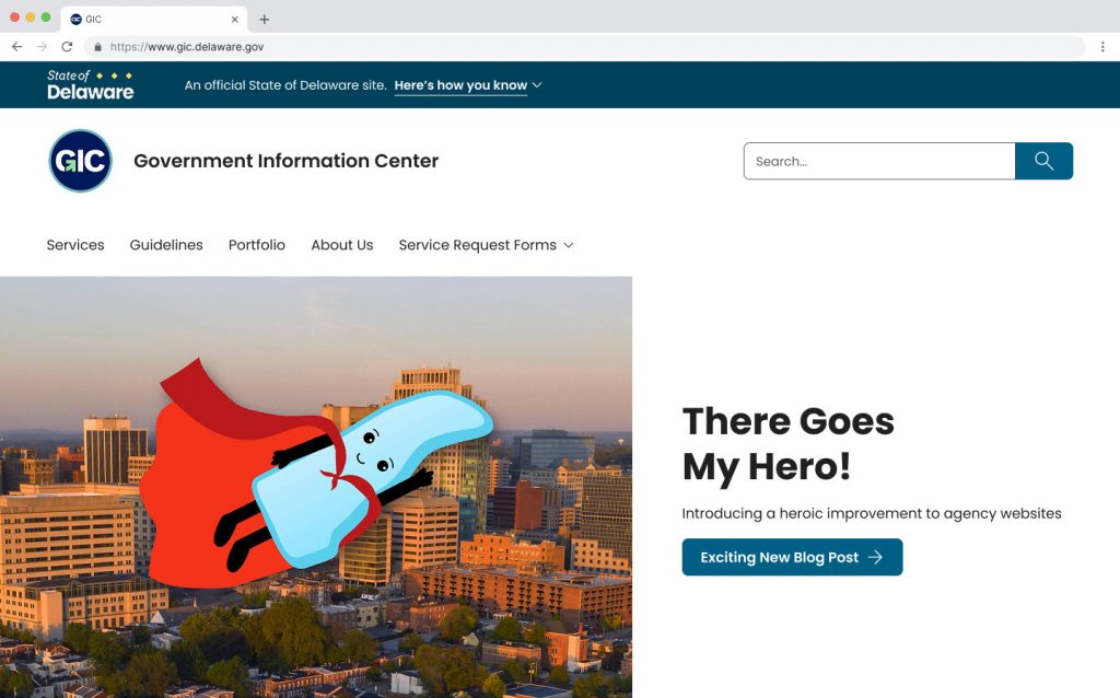
Super Delly is the hero we all need. He’s here to save the day, as it pertains to making your homepage as inviting and accessible as possible!
For the sake of clarity, the hero section that we’re actually going to be talking about is the large image and text beneath the header; essentially, your homepage’s top story or welcome message.
The best web designers will tell you that there’s a reason hero sections have become such an industry standard over the past few years:
- They give visitors an immediate area of focus.
- They announce the webpage owner’s goals or offerings.
- They set a tone that can welcome and invite visitors to explore important information that they might otherwise not find.
- Links in the hero section are almost always the most-clicked on any homepage.
The Backstory
In literature and film, The Hero character goes on a journey, faces incredible odds, and is somehow transformed in the process into something greater than themselves. This inspires others to follow their lead in some heroic fashion.
The hero section of a website gets its name indirectly from these same concepts.
In the 1800’s, product packaging often featured an image of a famous and celebrated person of the times. These were often members of nobility or the military or both. The goal was to associate the product with a noble conquest, to imply that the consumer could get a taste of that greatness and transform themselves with whatever elixir was being sold.
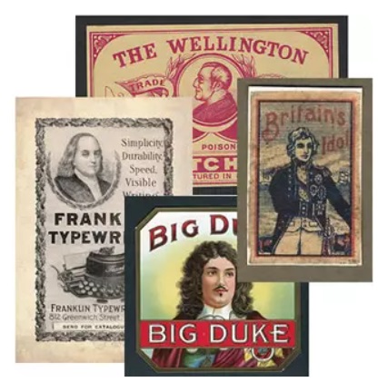
Modern likeness and image trademark laws were borne of this era, in which very few of the actual heroes whose names were being traded upon were ever compensated.
The primary image became known as the Hero in packaging, advertising and eventually in the print industry as well. The goal is the same today in our Delaware agency website hero sections: to draw visitors in with the promise of a compelling story.
The Dilemma
So why change what Delaware agencies are doing now? There are a few primary reasons that the new Lighthouse design system will be tweaking the format.
- Accessibility: Hero sections don’t currently have restrictions that prevent users from posting enormous images. These images can overwhelm visitors and push information beneath the fold or scroll line. Another challenge comes when text is placed over top of the image. Sometimes this looks great, but it can always trip up screen readers, and make text difficult to read for anyone when there isn’t enough contrast behind the text placement.
- Clarity and Efficiency: While we want the hero section to feature an important image, it’s also important that it not take over the entire page. If the hero section is the only thing visitors see, they may think they’ve come to the wrong site.
- Consistency: Our collective goal as a Delaware state agency website should be to have a consistent, unified look that will immediately give visitors confidence that they have come to the official source.
In the Nick of Time
There’s no need to fear! The GIC and Lighthouse are here!
Here are some of the features of the new and improved hero section:
- Limited image size to ensure more information/links remain near the top of the homepage
- Text will be distinct and separate, positioned on the right side of the screen on desktop or beneath the image on mobile (as seen to the left)
- The text and imagery will be responsive, remaining distinct from one another on screens of all sizes
- The text fonts and spacing are designed to meet current and future accessibility standards.
We’ll eventually have all the new guidelines and examples to play with in the new Lighthouse Storybook in the new year!
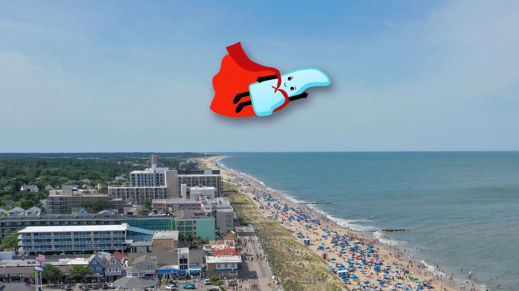
Remember- your information can change the lives of Delawareans, and it literally travels the state faster than a speeding bullet!
Epilogue
Oh, and by the way, in case you ever think the work of our amazing Delaware state agencies is anything less than heroic?
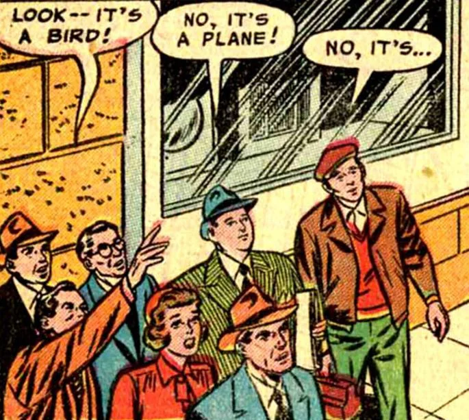
We submit the following evidence to the contrary from DC Comics. It clearly confirms that Metropolis, home of Superman, was planted firmly within the First State, right on the Delaware Bay!
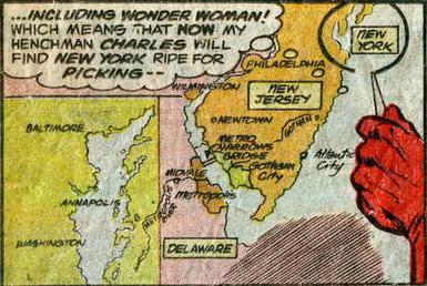
So don’t ever doubt your ability to help Delawareans through the superpower of online communication!
We’re here at the GIC to help you find that transformative path!
Join us again next time.
ALSO- a big Lighthouse announcement is coming up in our next blog post, so keep an eye out for that, too!
The End…?
Stay Updated
Receive the latest news from the GIC.