A Love Letter to White Space
Posted on April 15, 2026
NOTE: The terms white space and negative space are interchangeable. White space is not necessarily white (as seen in the photo below), and negative space is a positive when used thoughtfully. We’ll be sticking to white space here for consistency.

It’s not the notes you play, it’s the notes you don’t play. – Miles Davis
Miles Davis was a champion of economy in music. French impressionist composer Claude Debussy said: “Music is the space between the notes.” For generations, musicians and artists have paid attention to that space.
A study has even shown that musicians can actually communicate through anticipation, through the pauses themselves.
Sometimes the thoughtful omission of content is what actually creates a masterpiece.
Another example, a little closer to what we do in Delaware government websites, is Google. Here’s a screenshot from Google’s initial launch back in 1998:
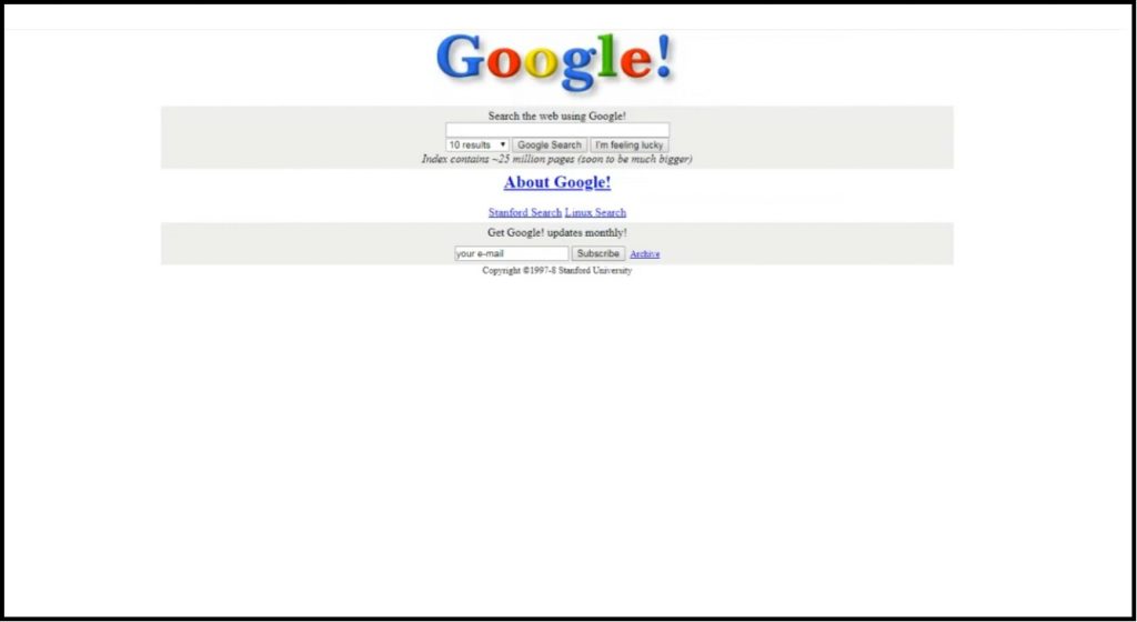
At that time, bandwidth was low and search engines took a long time to find anything, if they would even fully load on older computers.
Google chose a white home screen with only a handful of text links, with no images other than the logo. This ensured the page would load correctly, even on browsers that were already outdated.
A radical and effective absence of content.
Here’s what Google’s contemporaries Alta Vista, Netscape and Yahoo looked like in 1998:
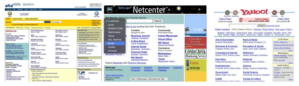
Google leaned into this philosophy and removed even more of the non-search content and added even more white space as their profits increased.
The result is one of the only websites whose homepage could truly be described as iconic. Memorable for its clarity of purpose, its efficiency, and its audacious business model that hid the advertising within the search results.
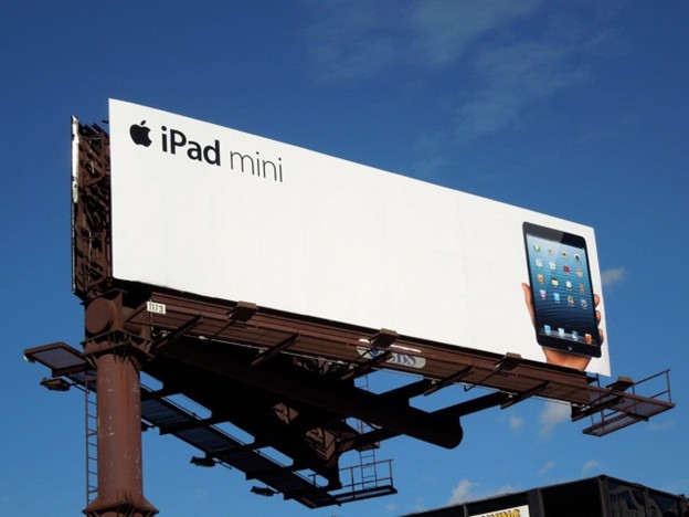
At the time, competitors wondered how they could possibly afford to have such a powerful billboard and waste so much of it with blank space?
Apple did not wonder, and made white space a prominent feature of the coolest ad campaigns of the late 2000’s. Less was more.
The common thread within these success stories is the careful pacing of content, with built in pauses and spaces to encourage people to lean in and process the message thoughtfully, rather than defensively.
How White Space Helps
Google’s primary call to action could not be any clearer. Of course, Delaware state agencies have more than one function to share with the public, so our websites must be organized to avoid overwhelming visitors.
Readability and Comprehension
White space reduces visual clutter and makes text easier to scan.
When content is spaced well, users can process information faster and retain more of it.
Visual Rhythm and Hierarchy
White space provides an easy path for your eyes to understand flow of page.
A well-spaced page naturally guides users from headline → summary → action.
Context and Connectedness
Thoughtful spacing also helps provide boundaries between a group of related elements which better show content connectedness. Larger gaps signal new sections; tighter spacing shows related items.
Trust and Credibility
Research shows users perceive simpler, more balanced interfaces as more credible—and are more likely to engage with them.
For public sector websites, trust is everything. Clear design reinforces confidence in government services.
The Delaware Division of Arts is getting ready to debut its new Lighthouse website, but a sneak preview of one of the new pages helps illustrate the value of white space. Their page for the state’s twin Poets Laureate (they’re twins!) has been redesigned from its current format on the left to the new version on the right.
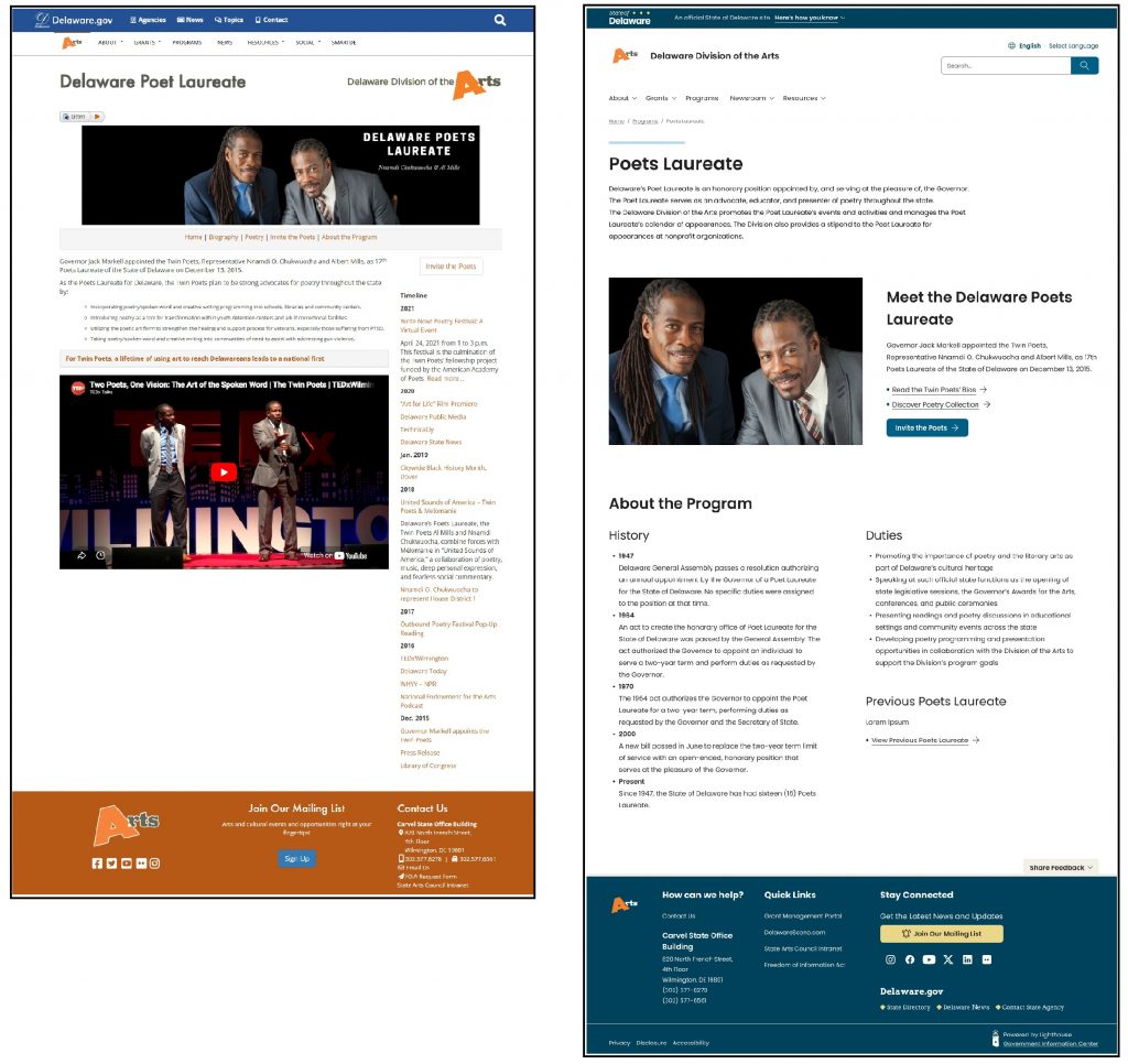
You’ll note that the fonts are larger and more consistent on the new page, and it’s easier for the eye to follow the content, which is more spread out. Yes, that makes the page “bigger”, but it also makes the flow and calls to action much clearer.
Consider also the difference spacing can make with the same amount of content:
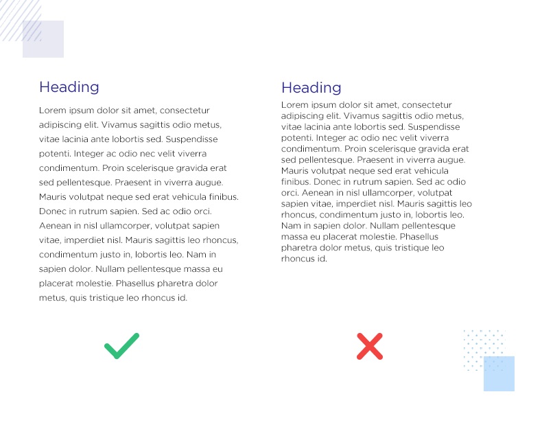
Your eyes and your brain work harder to read the same thing if it’s crammed together.
Here are some more visual examples of white space design.
White space helps answer key questions instantly:
What should I read first?
What actions can I take?
What information belongs together?
Don’t fall into outdated thinking:
“We need everything above the fold…”
This leads to overcrowded pages, even though users do scroll.
“We might miss something important…”
So everything gets equal emphasis—which means nothing stands out.
“White space is wasted space…”
It’s not. It’s what makes content usable in the first place.
Practical Tips for Delaware Agency Editors
You don’t need to redesign your entire site to improve white space. Start with content:
- Break Up Long Text
* Use shorter paragraphs (2–4 lines)
* Add spacing between sections
* Avoid large blocks of uninterrupted text - Use Lists Strategically
* Convert dense paragraphs into bullet points
* Add space between list items - Respect Margins and Padding
* Don’t crowd content against page edges
* Give headings and sections room to breathe - Group Related Content
* Keep related items close together
* Separate unrelated sections with more space - Prioritize, Don’t Stack
* Highlight the most important action
* Avoid placing too many competing elements in one area
White space isn’t about minimalism for its own sake. It’s about clarity, usability, and service delivery.
If you want to truly engage, try not to fill every space.
And remember… you don’t need to play every note!

Stay Updated
Receive the latest news from the GIC.