State vs. Agency Notifications:
Let’s Divide and Conquer!
Posted on October 4, 2024
Notification banners are a valuable way to alert website users to important information.
However, these features are often used inconsistently across Delaware agency sites.

Banners intended for emergency notifications are often used for non-emergency information, like event notification or links to existing pages on their sites. Here’s an example of useful and important information that may still not qualify as an emergency alert:

This can defeat the purpose of the alert system by desensitizing users to its presence.
Call it the “Breaking News!” syndrome; If that banner is always up, you know it can’t really be that urgent!
We’re addressing this in our new Lighthouse design system.
The biggest conceptual changes will be that we will be separating state-level alerting from agency specific alerting, and relieving agencies of the burden of the state-level updating altogether.
State-Level Emergency Notifications
Moving forward, the top emergency notification system banner will be reserved for statewide notifications and emergencies only.
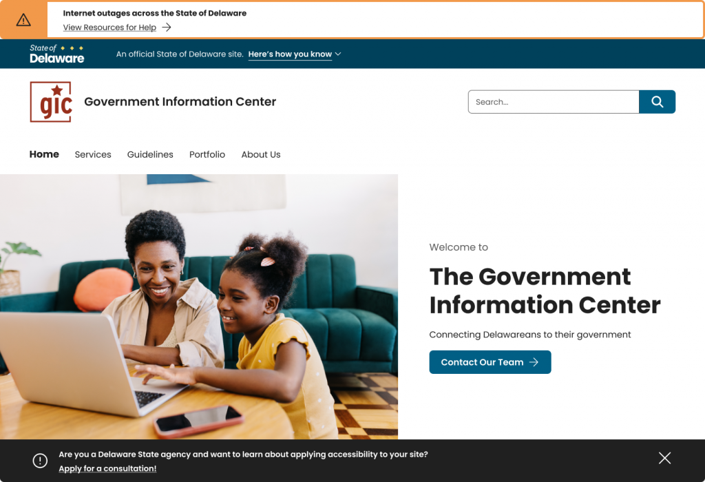
When activated, this banner will appear above the Delaware state portal banner, which appears above the agency title and logo bar.

There are several benefits to this concept: First, this banner will now be automatically populated with curated content that is deemed to be of true statewide significance. This means agencies will not have to worry about finding, verifying and updating this information themselves, it will come directly from top state government officials.
These alerts will now go live more quickly and with more accurate information than ever before. When you think back to the pandemic and the efforts to stay on top of the very latest health guidance and government mandate information, the value of an automatic feature like this starts to become clear.
The banners will also be color-coded and will contain identifying icons, which will improve visual clarity and help make them more easily understandable at first glance. They will appear with a title in bold font and may include additional information and/or a link to additional resources.
The color coding breaks down like this:
Red: Catastrophic and Major Incidents

This would include events requiring widespread and immediate government response or pose a significant risk to public safety. These might include events such as a terrorist attack, pandemic, natural disaster, power outages, hazardous spills.
Orange: Moderate Incidents

This category represents incidents that have a moderate risk to public safety but which may have potential to escalate. These would include severe weather warnings, widespread IT outages that could affect our websites such as the recent Crowdstrike outages.
Yellow: Minor Incidents or Important Information

These alerts are for information that is not about public safety or any other immediate risk, but which may require the public’s attention. These might include traffic closures or localized flooding conditions.
All of these decisions regarding icons, colors and banner content will be automated in Lighthouse. The decision to activate these banners will be controlled at the state level and overseen by your pals here at the GIC. We welcome any questions, but we are confident this represents a big improvement in delivering some of our most important information, and makes your life a little easier at the agency level.
Agency-Level Notifications
So what if you have an agency-specific alert that deserves home page attention? You had a big event planned but suddenly a power outage has forced you to cancel. You have an online job fair that is for this upcoming weekend only. It’s the final day to apply for that agency-specific grant. Not to worry, you still have the option of an agency-level banner.

The agency alerting banner will allow for text or links and will be populated with content and activated at the agency level. It will appear beneath the hero section of your homepage, and agencies will be limited to one alert at a time.
Here’s how both banners might look at the same time on our GIC homepage:

The new Lighthouse alerting system will ensure that true emergency notifications are clear and posted quickly. It will also separate state-level and localized agency-level alerts, which will now be distinct from one another.
The end result will be a cleaner, unified visual presentation that will actually serve Delawareans better while making the job of running a state website easier.
You can’t beat that!
If you have any questions about this feature, or about Lighthouse in general, please contact us and we’ll get back to you quickly. If you have a related story or question you’d like to ask our developers, please ask away and maybe we can help solve a problem!

We’ll have more to come on our development of the Lighthouse design system for Delaware state agency websites coming soon!
Stay Updated
Receive the latest news from the GIC.

